Update: as of September 2016 I've sold re:splashed. It was time to find a new home for the side project and make room for some new ones. ✌️
First, some background. Unsplash is a project by the fine folks at Crew (an invite-only marketplace connecting projects with talent).
Every 10 days they post 10 new stunning photos from talented people all over the world. 10, do whatever you want, royalty free photos for your next design or web project.
Yea, super awesome.
Enter re:splashed
So then what is re:splashed? Well, re:splashed is the result of a weekend hack project to dramatically improve the experience of browsing and discovering Unsplash photos:
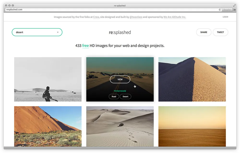
Sounds simple, right?
While the premise of Unsplash was great, the actual user experience of browsing and discovering new photos was less than ideal.
So I set out to build re:splashed with three goals in mind:
- Discoverability - make it easy to find great images.
- Speed - make it fast! Long loads and unresponsive UIs are bad.
- Simplicity - keep it stupid simple and focus on core user tasks.
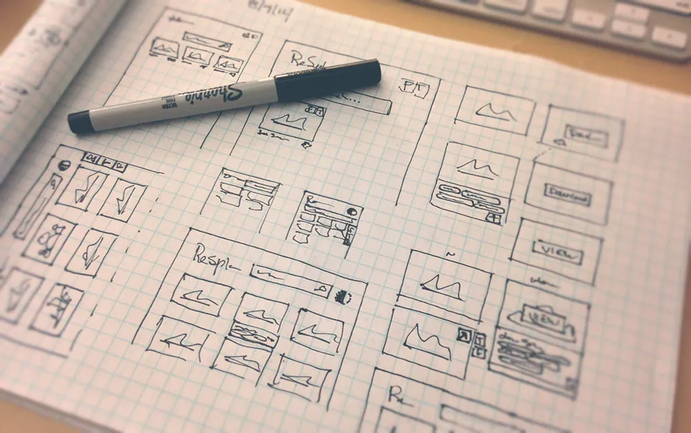
Discoverability
With Unsplash, one of the biggest hurdles was actually finding the image you needed. Looking for a great shot of the ocean? Start scrolling and maybe you’ll find one.
While the long page, single scroll, lazy loading of images is great for casually browsing, it’s less than ideal for quickly finding what you need.
Finding similar photos
Problem: Finding similar photos (i.e. show me all the photos of the ocean, or mountains, people, etc) is impossible. Again, start scrolling…
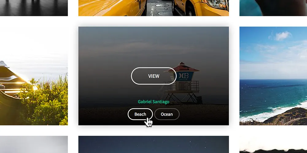
Solution: Simple tags based on high-level generic keywords. Found an image of beaches but curious to see other similar photos? Simply click on the beach tag and instantly see all other beach photos.
Tags present a simple sorting method that drastically improves discoverability. It’s now super easy to quickly discover awesome images navigating by just tags alone.
Search Please
Problem: I know what I’m looking for. Can I just search?
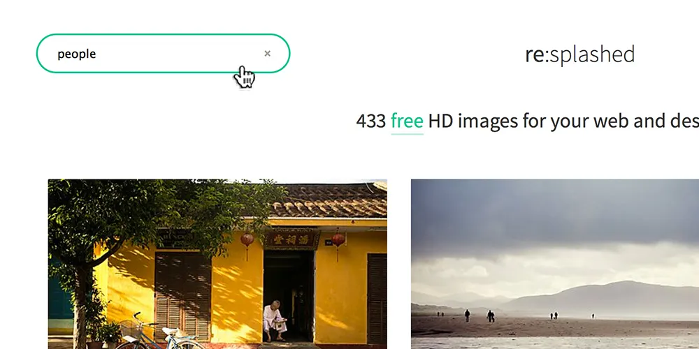
Solution: One awesome benefit of having tagged photos is search. With all of our images now cataloged with basic tags (thanks wife!) searching across the 400+ images for exactly what you’re looking for is now possible.
Viewing multiple images
Problem: Ultra-large previews of the images are nice, but they make viewing more than one image at a time impossible. These large images also take forever to load. More on that later though.
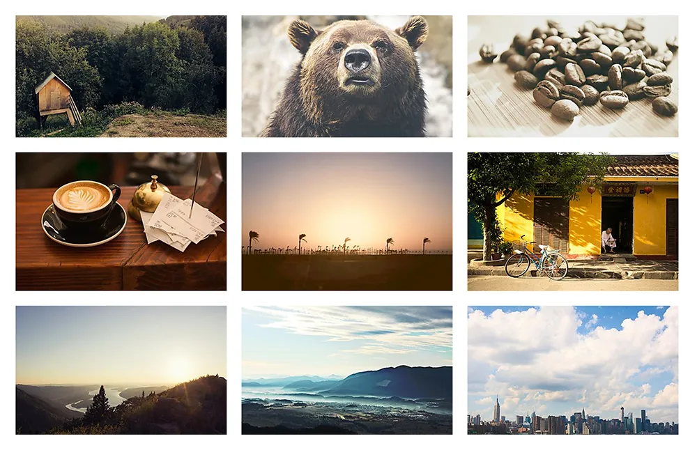
Solution: Present images in a smaller format – 3 across per row. In a single viewport / screen this means you can easily view 6-9 images at a time.
Speed
With the discoverability of photos dramatically improved it was time to turn to the next goal: speed. It was important to keep the experience snappy and fast.
This was achieved with 3 core techniques:
-
Responsive images. No, we’re not just talking about max-width: 100% here. Instead, we’re talking about only loading images as big as they need to be. So instead of loading that huge image and scaling it down, we load an image at the exact dimensions we need which drastically reduce file size and load times. This is made incredibly simple with services like imagefly.
Author’s note: the site isn’t yet fully responsive. Come on - it’s a weekend hack project ;-)
-
Lazy loading images. This is pretty common now a days but still super important nonetheless. Lazy loading images allows us to only load the image assets the viewer will actually need and see. This is done by setting the src attribute of every image to a 1x1 blank pixel on page load. Then, when the viewer scrolls down the page (or searches) bringing a new image into view, we simply swap the actual image src and load that image on demand. Simple, but crazy effective.
-
Real-time search & image filtering. Yup, you read that right. Search is done in real time on the client (in your browser). This means as you begin to type ‘des’ you’ll immediately begin to see images tagged desert and more. Users have come to expect instant responses to their actions. With tagged images, we can now search across all our photos and present you with exactly what you’re looking for, instantly.
Simplicity
Of course, almost none of this would matter if re:splashed wasn’t simple to use. With an idea of the top use cases and user needs, or jobs to be done, I was able to craft a super focused user experience.
Primarily this meant three things:
- Help users discover images faster & easier
- Let them download their chosen photo in a single click
- Reduce the UI & design to only the core, necessary elements
-
Simple Search and Discovery. On page load your search bar is ready, loaded and focused. That’s right - just start typing the moment the page loads and you’ll be on your way.
Better yet, once you’ve found an image you’re looking for you can easily see what other categories it’s tagged in and view those related photos. Simply hover over any image, find a related tag, and click. Your view is instantly filtered.
-
Simple Downloads. See a photo you like? Well, just click on it to download or view larger. Simple.
It sounds obvious sure, but try using Google Image search or any stock photo site.
-
Minimalist Design. The core experience is boiled down to discovery and downloading images. To that end, the UI and design all support these goals by getting out of the way and only showing you extra information as needed, just in time.
Less really is more.
Thoughts
I’d love to hear what you think. Give re:splashed a try and send me your feedback via twitter - @twanlass #resplashed
Colophon (of sorts)
If you’re the nerdy type and curious, re:splashed was built with a bunch of cool technology including:
- Firebase - for data storage and authentication
- Amazon S3 - for static files and web hosting
- CloudFront - a CDN to speed file delivery up
- imagefly - for on-the-fly responsive images & image resizing
- Google Fonts- Source Sans Pro to be specific :-)
- Echo.js - for lazy loading images as needed
- ImagesLoaded.js - JavaScript is all like “You images done yet or what?”
- Handlebars.js - simple templating
- List.js - real-time searching / sorting of images by tag
- jQuery - used, but on endangered species list
- Sass - because plain CSS just isn’t fun anymore
- Gulp - an awesome front-end build tool